
Creating a pie chart in Google Sheets is a straightforward process that can greatly enhance your data presentation. Whether you’re analyzing sales data, survey results, or any other statistics, pie charts are an effective way to visually represent proportions. In this guide, we will walk you through the steps to create a pie chart in Google Sheets, ensuring that you can effectively communicate your data. Additionally, we will touch on the importance of ''referrerAdCreative'' in digital marketing, especially when analyzing performance metrics through charts like these.
Step-by-Step Guide to Creating a Pie Chart
To create a pie chart in Google Sheets, follow these simple steps:
Step 1: Prepare Your Data
Start by organizing your data in a clear format. Ideally, you should have one column for the categories and another for the values associated with those categories. For example:
| Category | Value |
|---|---|
| Social Media | 30 |
| Email Marketing | 20 |
| SEO | 25 |
| PPC Advertising | 25 |
This format is essential for Google Sheets to understand how to build the pie chart.
Step 2: Select Your Data
Highlight the range of cells that contains your data. In our example, you would select both the categories and their corresponding values. Ensure that you include both column headers as they will be used for labeling your chart.
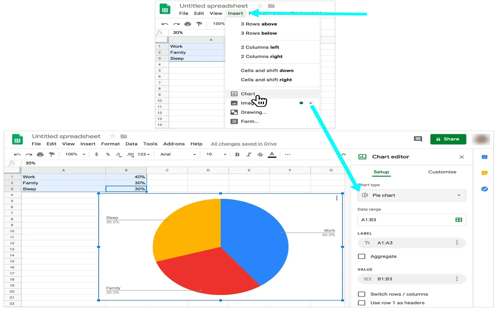
Step 3: Insert the Pie Chart
Once your data is selected, navigate to the top menu and click on "Insert." From the dropdown menu, select "Chart." Google Sheets will automatically create a chart based on your data. However, it may not be a pie chart by default.
Step 4: Choose the Pie Chart Type
In the Chart Editor that appears on the right side of your screen, click on the "Chart type" dropdown menu. From there, select “Pie chart.” You will see a variety of pie chart styles, including 2D and 3D options. Choose the one that best fits your presentation needs.
Step 5: Customize Your Chart
Customization is key to making your pie chart visually appealing and informative. In the Chart Editor, you can change colors, add labels, and modify the chart title. For clarity, it’s essential to ensure that each slice is labeled accurately, as this will help your audience understand the data at a glance. You can also add a legend to your chart for further clarification.
Step 6: Analyze Your Data
Now that your pie chart is ready, you can use it to analyze your data effectively. For instance, if you're evaluating the performance of various marketing channels, as represented by ''referrerAdCreative'', the pie chart can help you quickly identify which channel is performing best. This visual representation aids in making informed decisions about where to allocate your marketing budget.
Step 7: Share Your Chart
Once you are satisfied with your pie chart, you can easily share it with colleagues or stakeholders. Click on the "File" menu, then select "Share." You can share the entire Google Sheets document or just download the chart as an image to include in presentations or reports.
Benefits of Using Pie Charts
Pie charts provide several benefits, especially in data visualization:
- Visual Clarity: Pie charts are visually appealing and easier for audiences to understand compared to raw data tables.
- Proportional Representation: They effectively show proportions, making it easy to see how different categories contribute to the whole.
- Quick Insights: Users can quickly grasp insights without needing to dig through detailed data.
Conclusion
Creating a pie chart in Google Sheets is not only simple but also a powerful way to visualize your data. By following the steps outlined in this guide, you can create an informative pie chart that enhances your presentations and reports. Additionally, understanding how to analyze data related to ''referrerAdCreative'' with pie charts can significantly improve your marketing strategies. Whether you are tracking the performance of various channels or comparing survey results, pie charts can be a valuable tool in your data analysis toolkit.
Now, go ahead and give it a try! Organize your data, follow these steps, and create impactful pie charts that will help communicate your findings effectively.