When managing your inbox, keeping track of your unread emails can be a daunting task. By ''graphing your unread email count in Gmail'', you can visualize trends and better understand your email habits. This article will guide you through the process, including using tools and methods to create effective graphs. Let’s dive in!
Understanding Your Unread Email Count
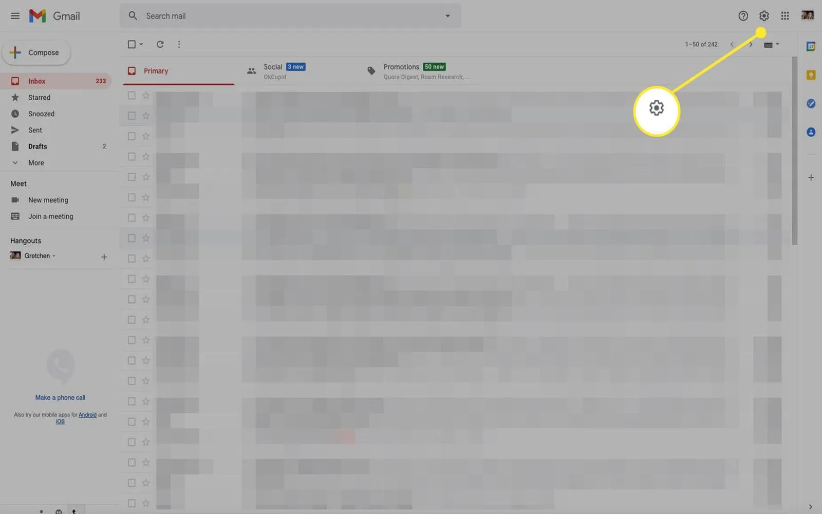
Before you can graph your unread email count, you need to understand how Gmail tracks these emails. Gmail displays the total number of unread emails in your inbox, which can fluctuate throughout the day. By monitoring this count, you can identify peak times when you receive the most emails and adjust your email management strategies accordingly.
Exporting Your Unread Email Data
To create a graph, you first need to collect your unread email data. While Gmail doesn’t provide a direct way to export this data, you can use some methods to gather it:
- ''Manual Tracking'': Check your unread email count daily and record it in a spreadsheet.
- ''Email Management Tools'': Use third-party tools that integrate with Gmail to track your unread email count automatically.
Once you have a week or more of data, you can begin to visualize this information.
Using Google Sheets to Graph Your Data
One of the easiest ways to graph your unread email count is by using Google Sheets. Here’s how to do it:
- Open Google Sheets and create a new spreadsheet.
- In the first column, enter the dates you tracked your unread emails.
- In the second column, enter the corresponding unread email counts for each date.
Your data might look like this:
| Date | Unread Email Count |
|---|---|
| 01/01/2023 | 15 |
| 01/02/2023 | 22 |
| 01/03/2023 | 10 |
| 01/04/2023 | 30 |
| 01/05/2023 | 5 |
Creating the Graph
After entering your data, follow these steps to create a graph:
- Select the data range you just entered.
- Click on the “Insert” menu, then select “Chart.”
- In the Chart Editor, choose the type of chart you want (Line chart or Bar chart works well for this data).
- Customize your chart by adding titles and labels to make it more informative.
Your graph will now visually represent your unread email count over time, allowing you to spot trends and patterns easily!
Analyzing Your Graph
Once you have created your graph, take some time to analyze the data. Look for patterns such as:
- ''Peak Times'': Identify days when your unread email count spikes. This can help you understand when you receive the most emails.
- ''Declines'': Notice days with fewer unread emails; these might indicate more productive email management.
- ''Trends'': Over weeks or months, look for trends in your email habits. Are you receiving more emails as time goes on?
Setting Goals for Your Unread Email Count
Based on your analysis, consider setting specific goals to manage your unread emails more effectively. For instance:
- ''Daily Limits'': Set a target for how many unread emails you want to have at the end of each day.
- ''Weekly Reviews'': Allocate time each week to review your unread emails and ensure you’re not letting them pile up.
- ''Unsubscribe'': If you notice you’re receiving a high volume of newsletters or promotional emails, consider unsubscribing to reduce clutter.
Conclusion
Graphing your unread email count in Gmail can provide valuable insights into your email habits and help you improve your productivity. By following the steps outlined in this article, you can create a visual representation of your email trends and set actionable goals. Using tools like Google Sheets, you can easily track and analyze your unread emails, helping you maintain a more organized inbox.
Remember, managing your email efficiently is essential in today’s fast-paced digital world. By taking the time to graph your unread email count, you can develop strategies that enable you to stay on top of your communication and reduce stress associated with an overflowing inbox.


